Lement Pro
Sodis Lab develops software for the digitalization of construction. Their flagship is Lement Pro, a low-code platform — a system where project managers, engineers, and site supervisors run construction projects from the work schedule to the final acceptance report. This wasn't a blank-slate startup: by the time I joined, the product already had around 11,000 users. A living codebase, real clients, years of legacy decisions.
Over 4 years I went from being the only designer to leading the design function: I built design processes, introduced a system of research and hypothesis validation, and turned design from a service function into an instrument that shapes what the product becomes — not just how it looks.
ConTech · B2B SaaS · 2021–2025 · Lead Product Designer
Context
Construction means hundreds of contractors, thousands of tasks, and approvals that must follow strict processes. Most teams used a patchwork of different tools for this — and learned about a problem only after it had already happened.
But the main challenge wasn't the screens — it was how decisions were made. The product team had a product owner who answered every product question the same way: "That's how it was before." Why is the interface built this way? Because that's how it was in the old product. Legacy logic kept reproducing itself — and the product, which was simultaneously being rebuilt from scratch, risked inheriting all the decisions whose reasons nobody remembered anymore.
The only counterweight to the "it's always been this way" argument was data. That's how research became not just part of the process, but the way to earn the right to make product decisions at all.
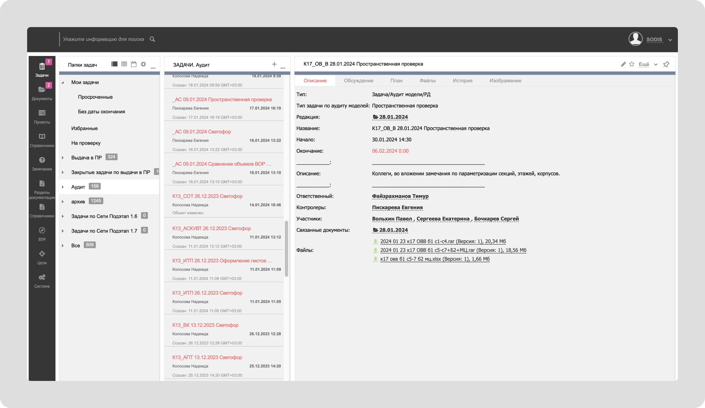
The old version of the product: an interface that grew out of development logic, not user needs.
Process
80
interviews
15
usability tests
I built the research process from scratch — before me, the company had no systematic feedback channel that influenced product decisions. The format: customer development interviews, hallway tests, in-depth interviews. Over four years: 80 interviews and 15 usability tests.
The range of sources was the point. I talked to clients directly, at both levels: decision-makers and the everyday employees who work in the system daily. These two views of the product almost never matched. On top of that, feedback came through the implementation team, marketing, support — and through the CEO, who brought requests straight from client negotiations.
Research became the filter for everything described below.
What had to change around the product.
Features born from research had to be defended before the product owner and the CEO — and that required a culture where decisions could be shown and discussed at all. I introduced regular demos: design demos first, then development followed. For the first time, the company had a place where the product could be seen before release — where arguments happened over mockups, not in production. In parallel, my team and I built a design system.
Portfolio
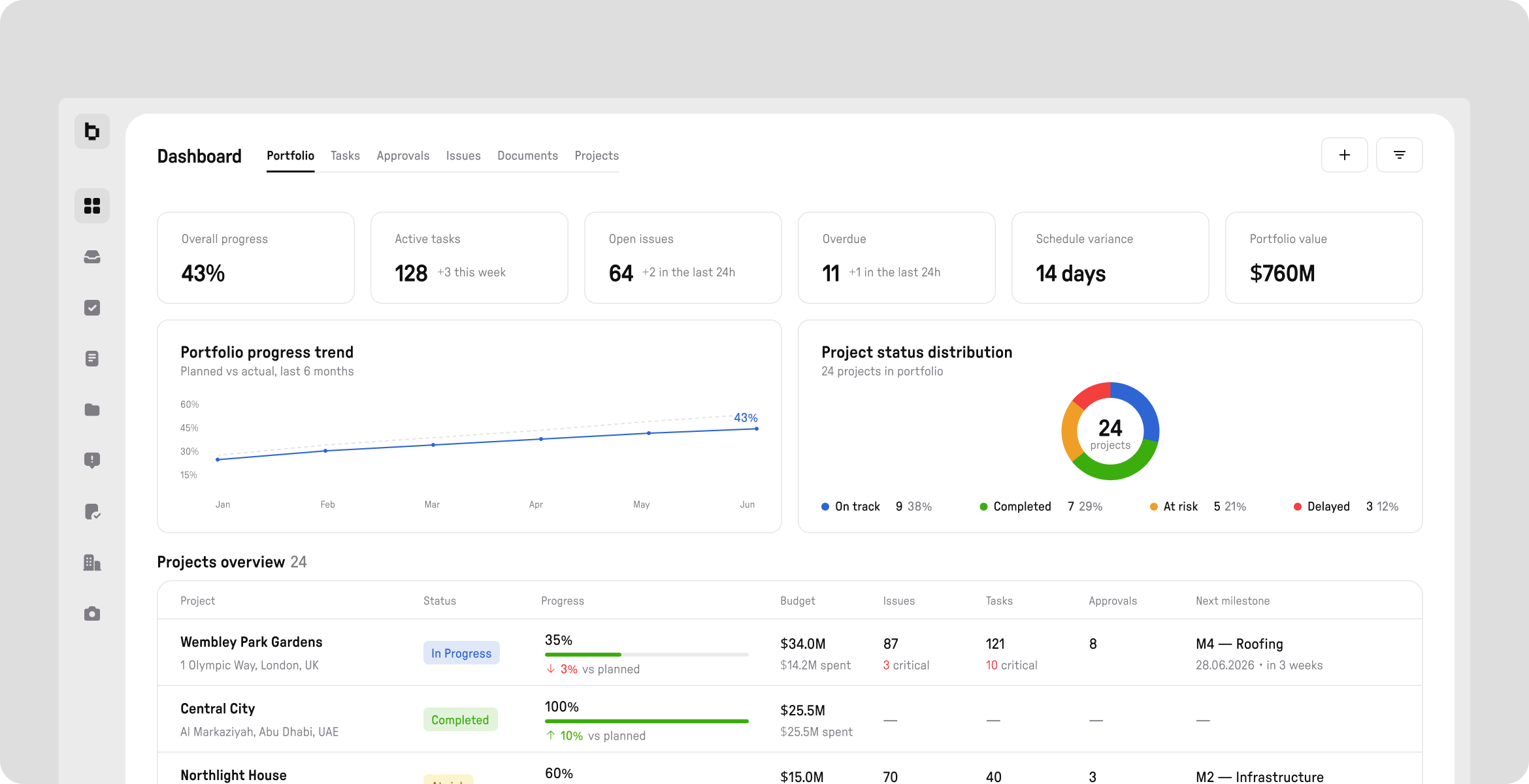
The first screen a portfolio manager sees is a table of projects with live data, not a list of names. Progress, budget against actual spend, the number of critical issues, the next milestone. If a project is "At risk" with 70 open issues — you see it immediately, without drilling in.
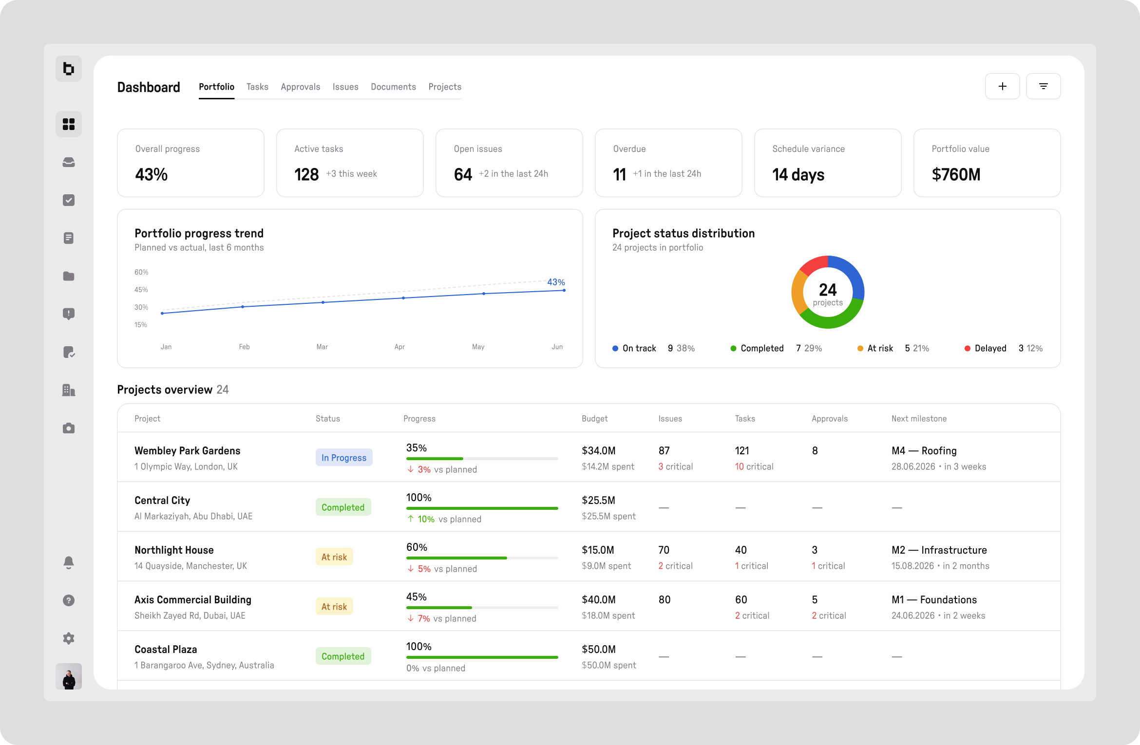
Six metrics in the header hold the big picture of the portfolio: progress, active tasks, open issues, overdue items, schedule deviation, portfolio value.
Widgets
A universal screen can't serve everyone well: different roles ask different questions of the same project. So instead of a fixed dashboard, I designed a builder based on ready-made widgets — each user configures them around their own tasks.
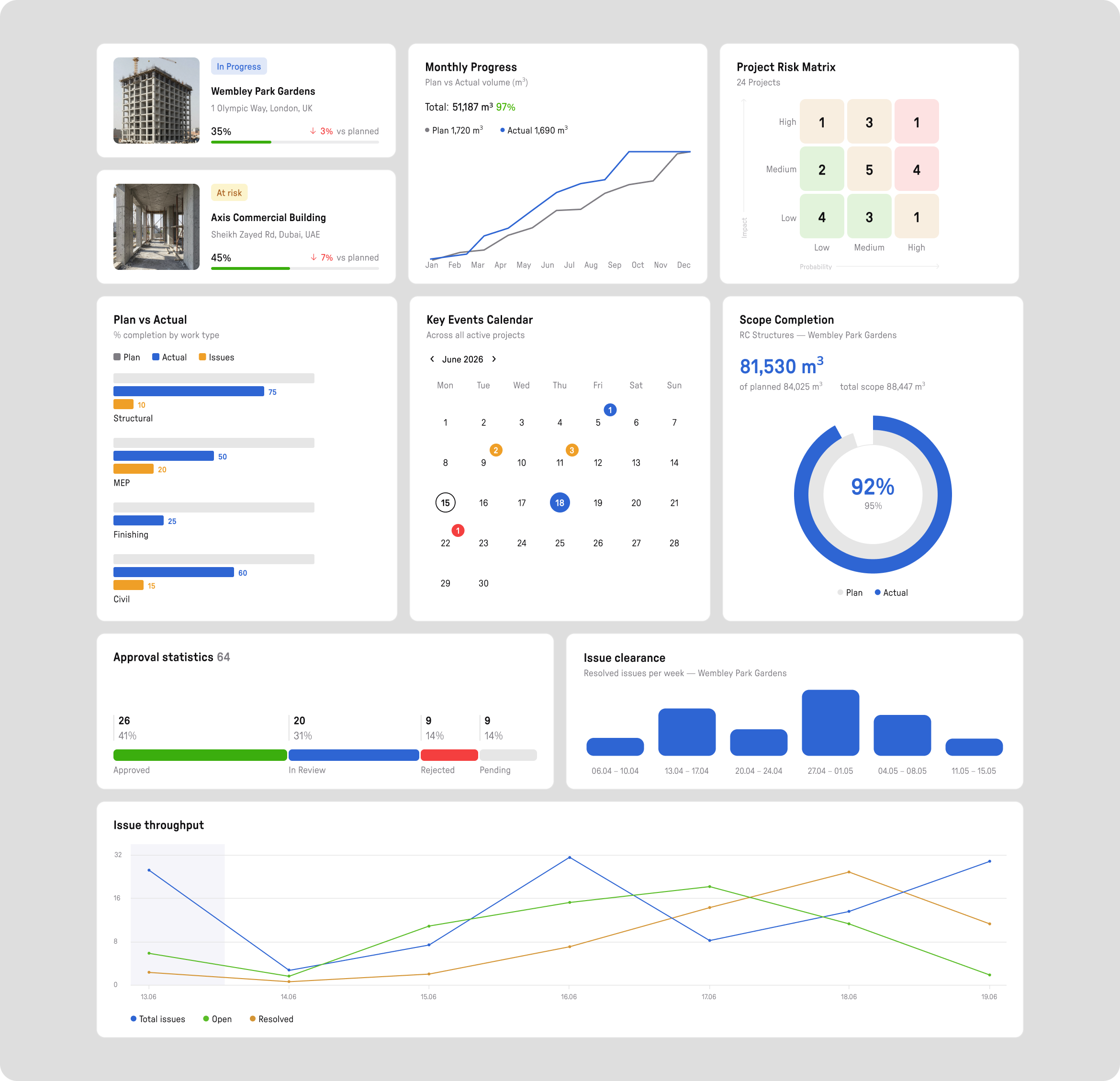
The widgets speak the language of construction: plan vs. actual by discipline, scope completion, risk matrix, approval analytics. Everyone assembles their own set for their own role.
Tasks
List, Gantt, and Calendar show the same task hierarchy with no manual syncing between views. Switching between them doesn't reset the context — only the angle changes, not the data.
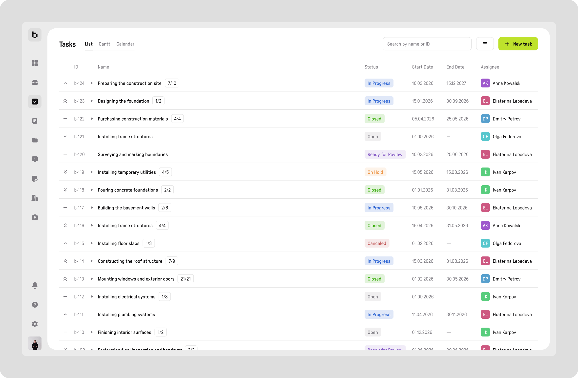
The list shows where a task really stands — without opening the card.
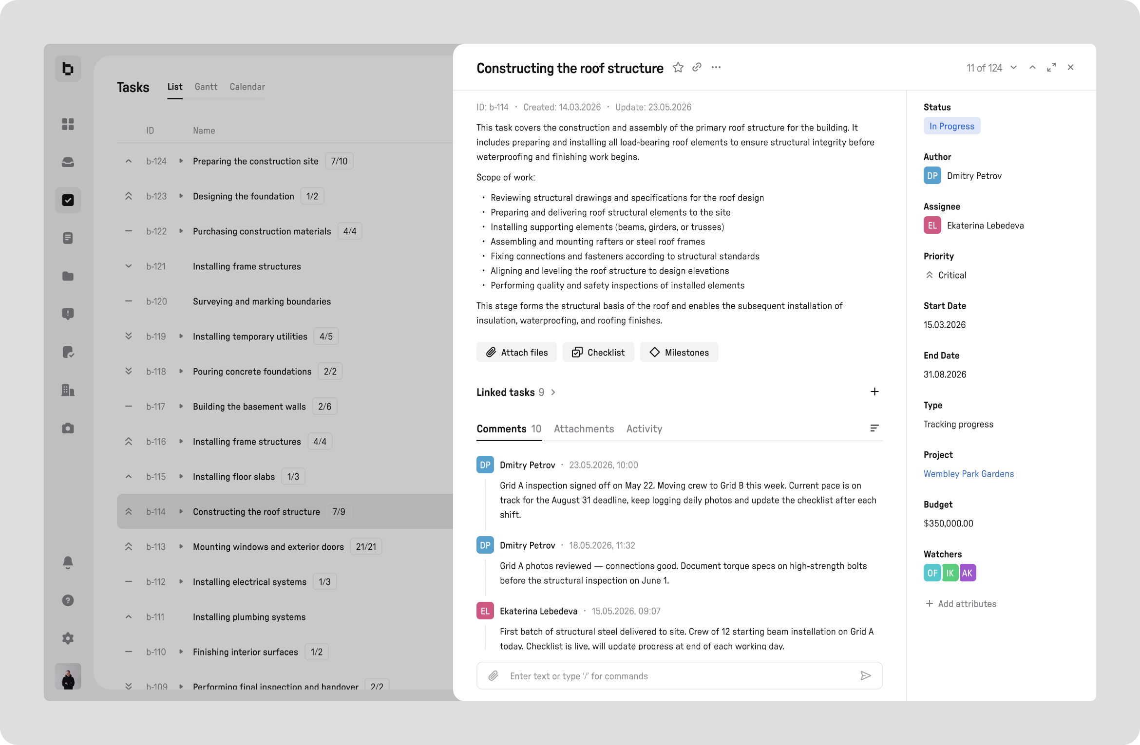
The card is built around the scope of work, not the status: itemized volumes, a checklist, linked tasks, and the attributes that matter on a construction site — budget, priority, watchers.
Schedules
Above the work schedule sits a 3D model of the building at its current stage. This is a direct answer to a scenario that kept coming up in interviews: "The table says 60% done, but the site doesn't look like it." Progress on the Gantt can be checked against what's physically built, instead of trusting percentages.
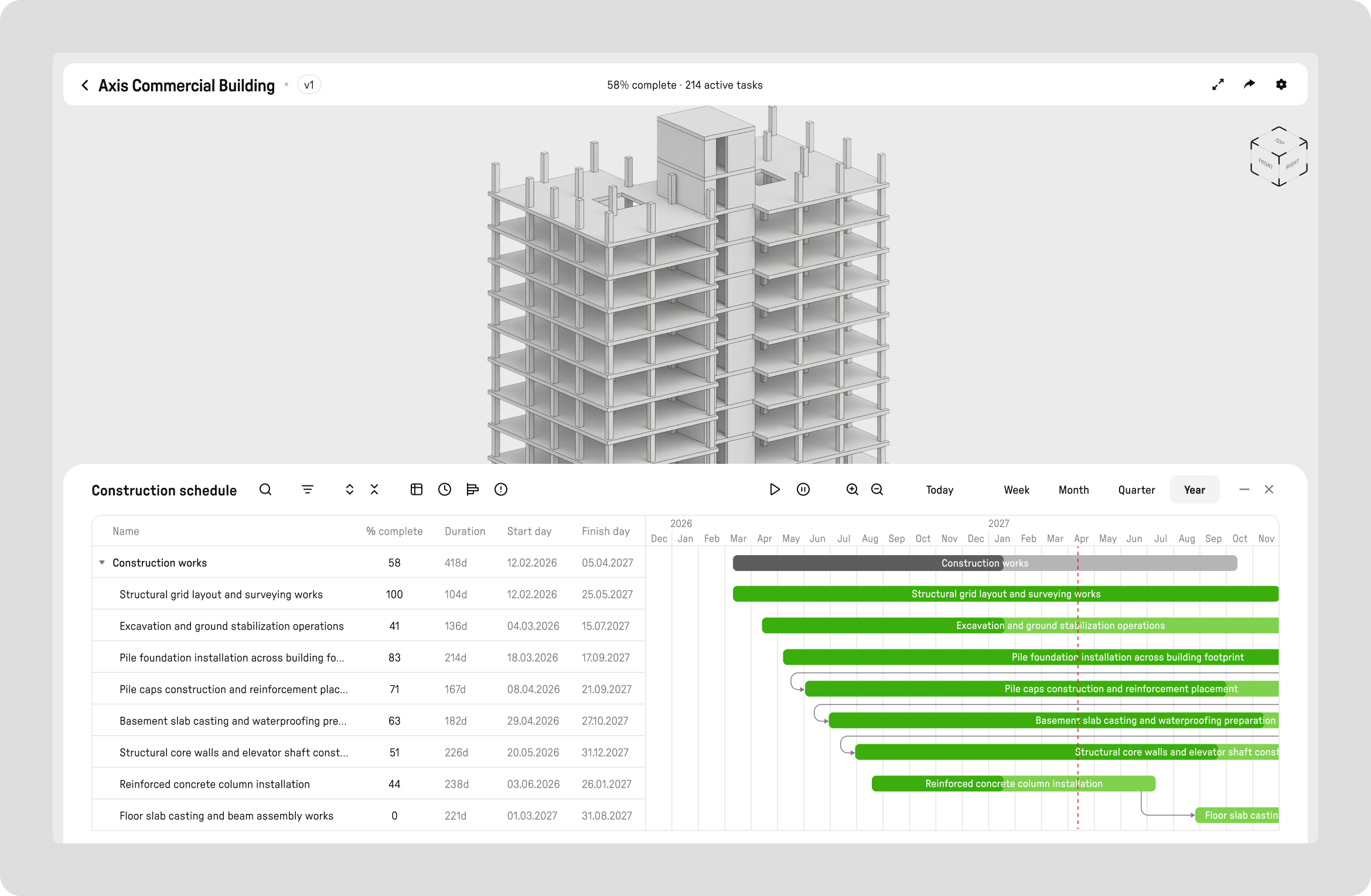
Visually tying the schedule to the model makes the gap between "on paper" and "on site" obvious.

At full project scale — multiple levels of WBS nesting, dependencies between tasks, and a "today" line that keeps the schedule honest.
Workload
Workload is deliberately not a separate section: resources almost always need to be viewed in the context of the schedule, not in isolation. Plan and actuals for every day, color-coded overload and underload — for individuals and for teams.
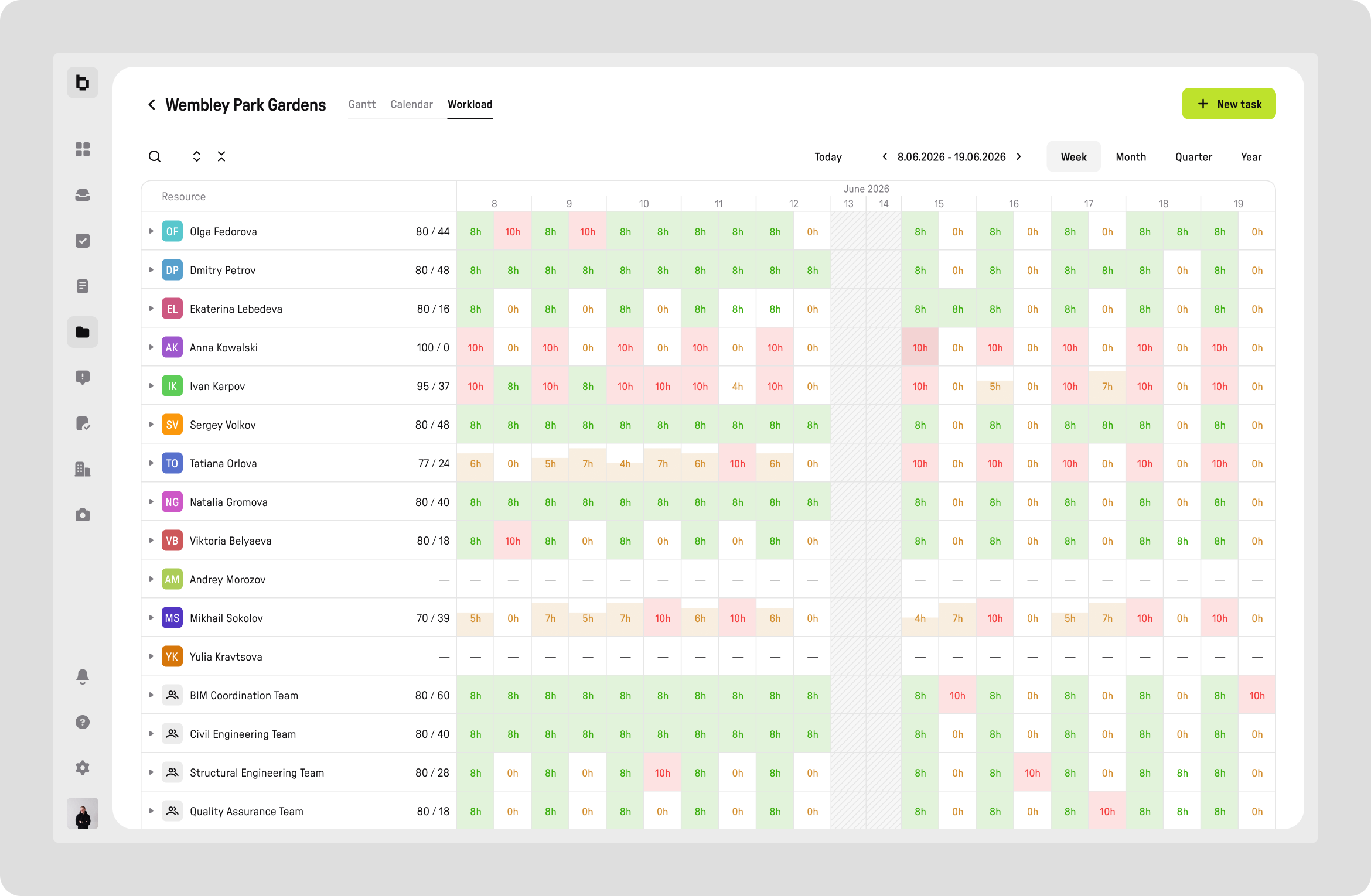
Overload is visible instantly — the interface highlights the problem, so no one has to do the math in their head.
Issues
Before the redesign, an issue from the construction site was a photo in a chat thread, drowned in the conversation within an hour. I designed issues so that they simply couldn't exist without being tied to a specific building element.
This decision changes the very mechanics of how problems are handled on site: issues no longer get lost — they're physically anchored to the place where they occurred.
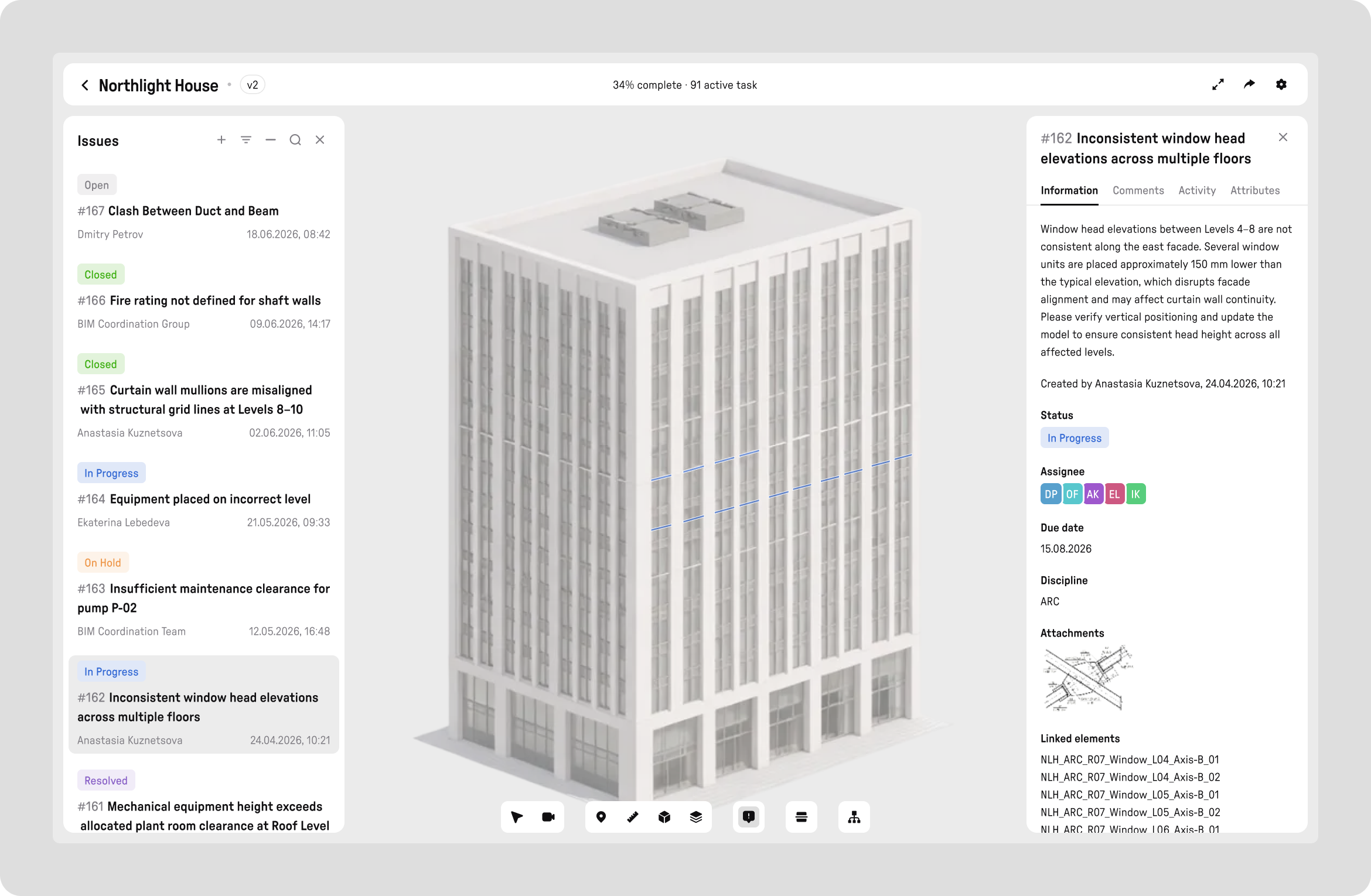
The issue list is linked to elements of the 3D model: select an issue, and the element lights up on the model.
Approvals
The approval process mirrors the real logic of construction: a rejection at any step doesn't stop the process — it sends the document back for rework and resubmission. I didn't simplify the processes. I digitized them as they are.
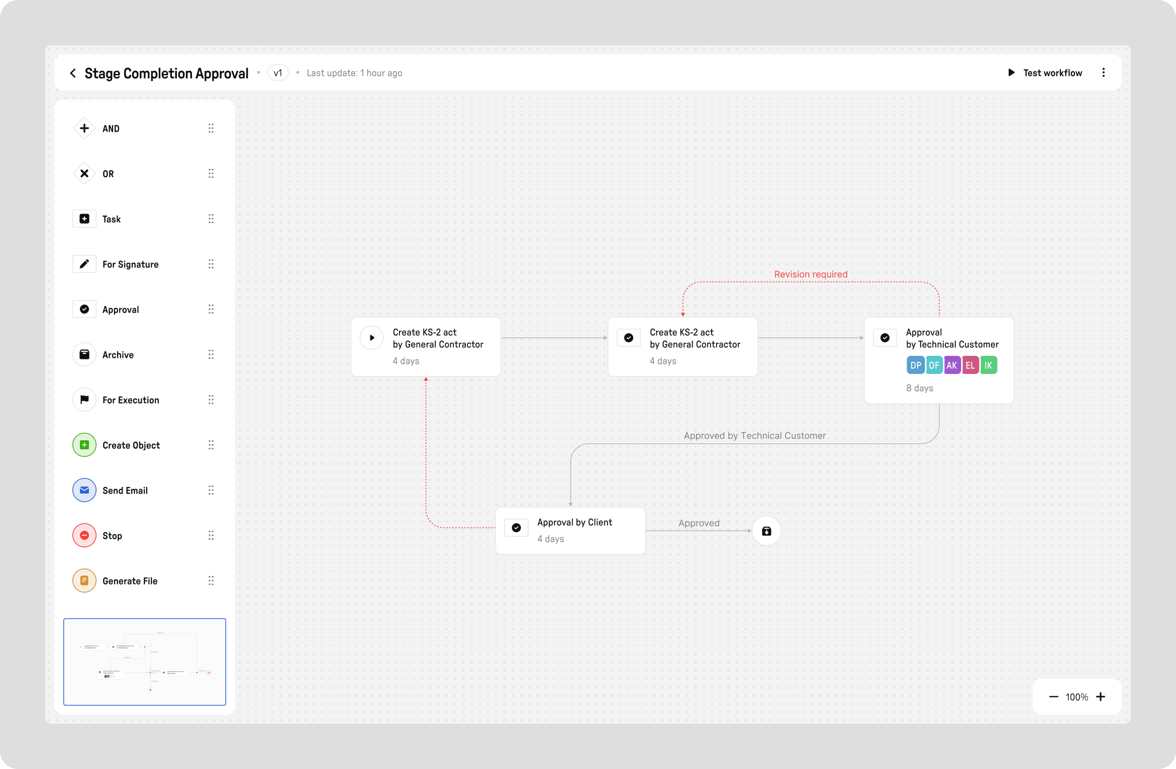
A visual builder. Any user can assemble any approval process without developers: steps, assignees, transition conditions.
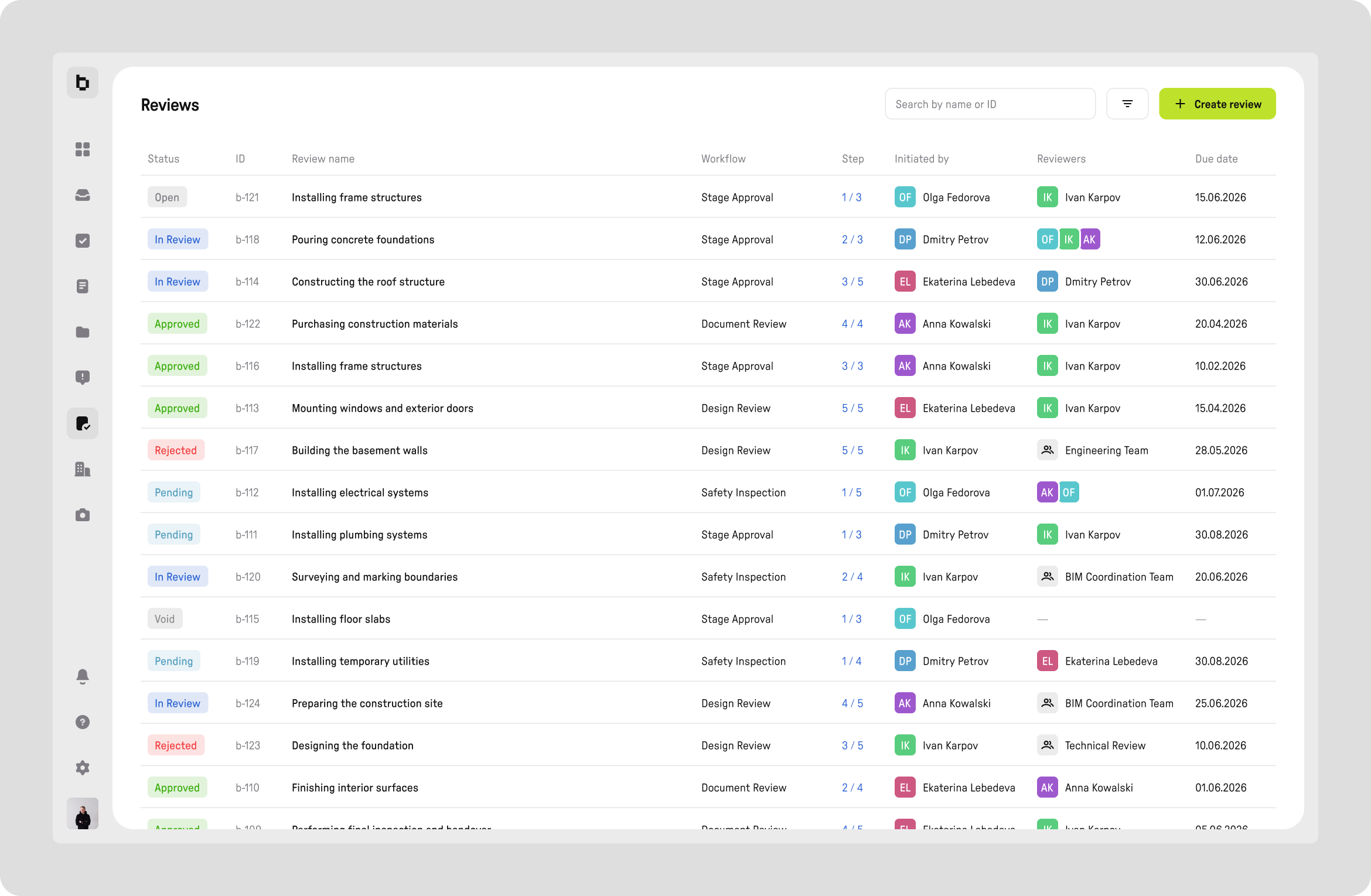
All approvals across all projects in one list. One view for the whole portfolio — you instantly see what's stuck and with whom, without opening each project one by one.
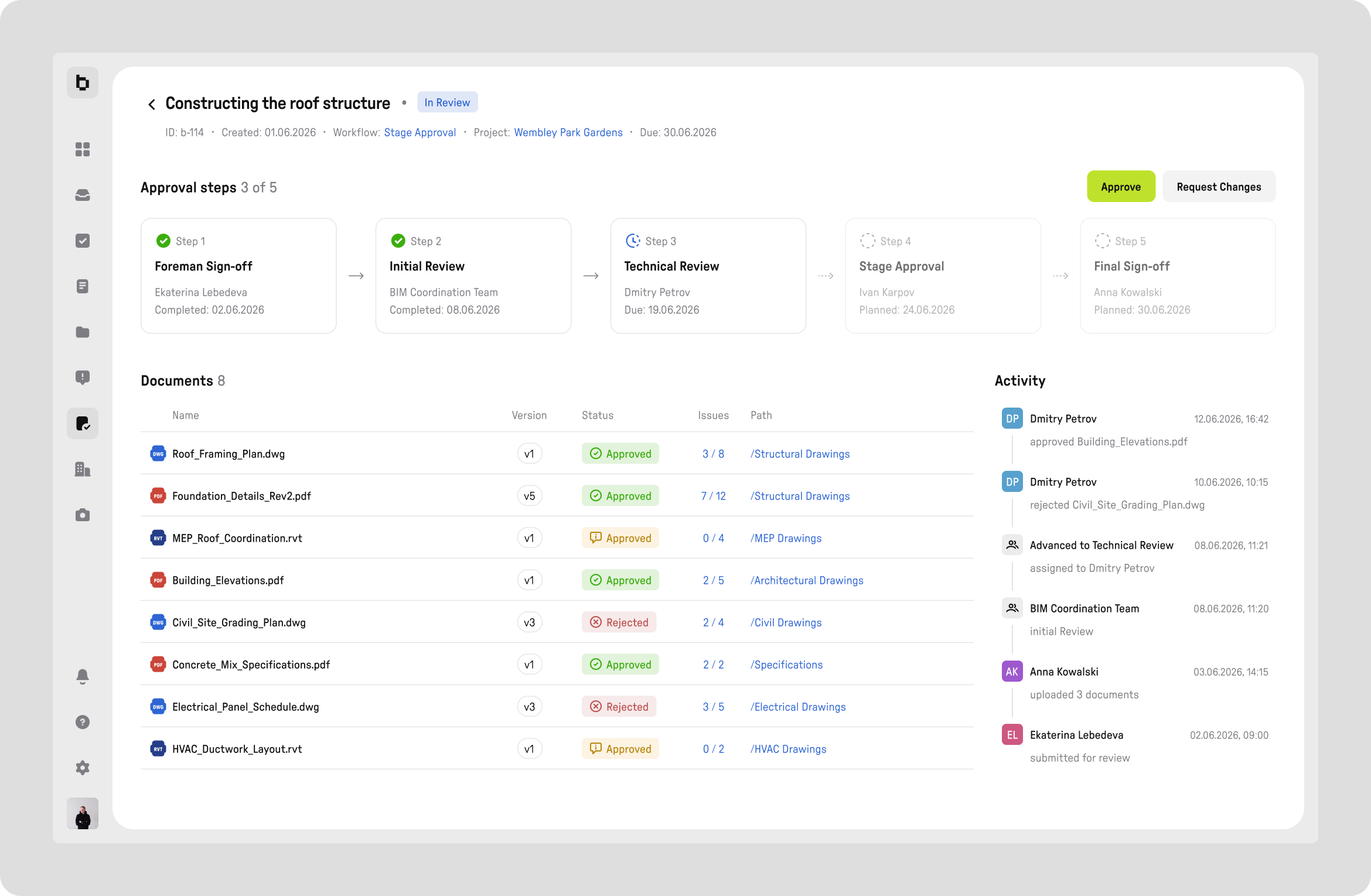
The approval card. A manager sees the full chain: who approved, who returned it, what comment they left. A regular user sees only their own document. One process, two different interfaces for two different jobs.
Common Data Environment (CDE)
This is not a general-purpose file manager — it's a common data environment designed around how construction documentation actually works, not around an abstract folder hierarchy.
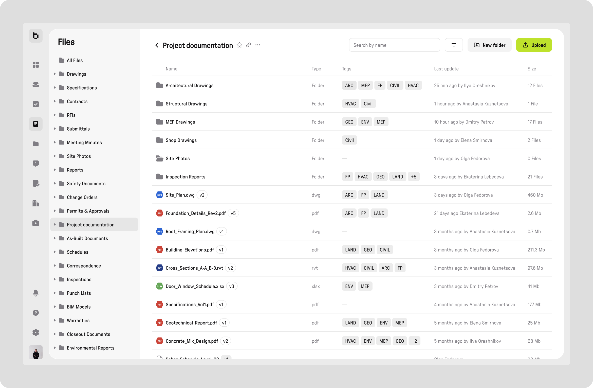
Folder structure with discipline tags and versioning. The structure mirrors how real construction documentation is organized.
Outcome
+35%
approval speed
−40%
manual clarifications
+20%
user engagement
Four years in one product is a rare chance to see how design decisions perform in real operation, not just at handoff. The approach of "understand the processes first, design the screens after" gave the platform a language that engineers and project managers recognize as their own. I didn't have to teach users anything new — I designed the interfaces around how they already worked.
But the most lasting change isn't in the screens — it's in how the company makes decisions. Demos appeared. Arguing over mockups instead of production became a habit. And a stronger answer than "that's how it's always been" emerged: the words of real users. Design came into the company as a service — and stayed as a way of thinking about the product.