Lement Pro App
Lement Pro is an enterprise platform for construction project management: tasks, planning, approvals, and a common data environment (CDE). The web version covers office work — project managers, document workflows, planning. But construction doesn't live in the office.
This is a case study about a mobile MVP: a narrowly focused app for the people physically present on site. Not a scaled-down copy of the desktop, but a separate product for a different context of use.
ConTech · Mobile MVP · iOS · 2024 · Lead Product Designer
Context and hypothesis
Critical events happen on site: a defect is found, a drawing goes out of date, an act is waiting for a signature. Yet the tool for responding is in the office, at a computer. The gap was patched with workarounds: photos in messengers, notes on paper, verbal agreements. Information got lost on its way from the site to the system.
The MVP hypothesis: give field roles — the site foreman, the engineer, the technical supervisor — a mobile tool built for their real scenarios, and data will start entering the system the moment things happen, not in the evening from someone's retelling.
The MVP was built precisely to test this hypothesis: a deliberately narrow scope, only what's needed in the field.
Research
The scope was defined by research, not assumptions — from two sides.
Decision-makers
project managers, chief project engineers: interviews about where information gets lost between the site and the system, and which decisions can't wait for a return to the office.
Field roles
site foremen, site engineers, technical supervisors: what a day on site actually looks like, what gets recorded and how, and why data doesn't make it into the system.
In parallel — an analysis of the mobile apps of market leaders: Procore, Fieldwire, PlanRadar, Autodesk. Despite their differences, they all converge on the same set of field patterns:
• Offline-first — sites have no stable connection: basements, steel structures, and so on;
• Pin-on-plan — a defect is recorded as a point on the drawing;
• Camera-first — photo as the primary input method;
• Version awareness — the user must see they're looking at the current drawing revision;
• Approval on the go — documents get approved from the phone.
Research confirmed:
People working in the field don't need Gantt charts, resource planning, or analytics — those are office tools. They need a short set of scenarios that can be done with one hand on an unstable connection.
Principle
The key design decision was to refuse to transfer the desktop navigation to the phone. The web version's module hierarchy stayed on the web. The mobile structure is built around five field scenarios.
Home screen
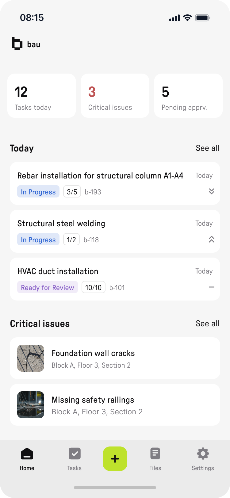
The day at a glance: counters for tasks, critical issues, and approvals; today's task list; critical issues.

Tasks
Search instead of a filter system. In the field scenario, the user is looking for a specific task, not exploring a list.
Viewing issues
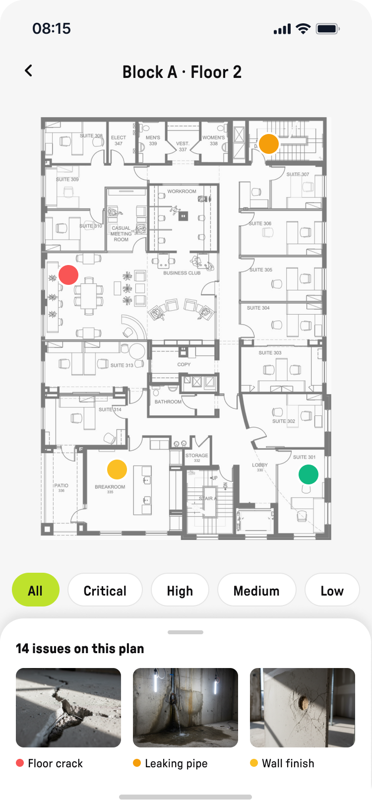
Floor plan with issue pins. Filter by severity. The industry's core pattern: a defect lives on the drawing, not in an abstract list.

Creating an issue
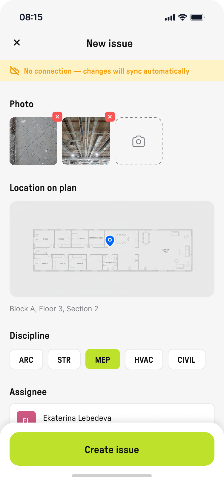
Camera photo, pin on the plan, discipline, assignee. The scenario is built for entering information fast.
Creating an issue (offline banner state)
The issue is saved locally and syncs once the connection returns. Offline is not an edge case — it's the mandatory default state.
Task detail
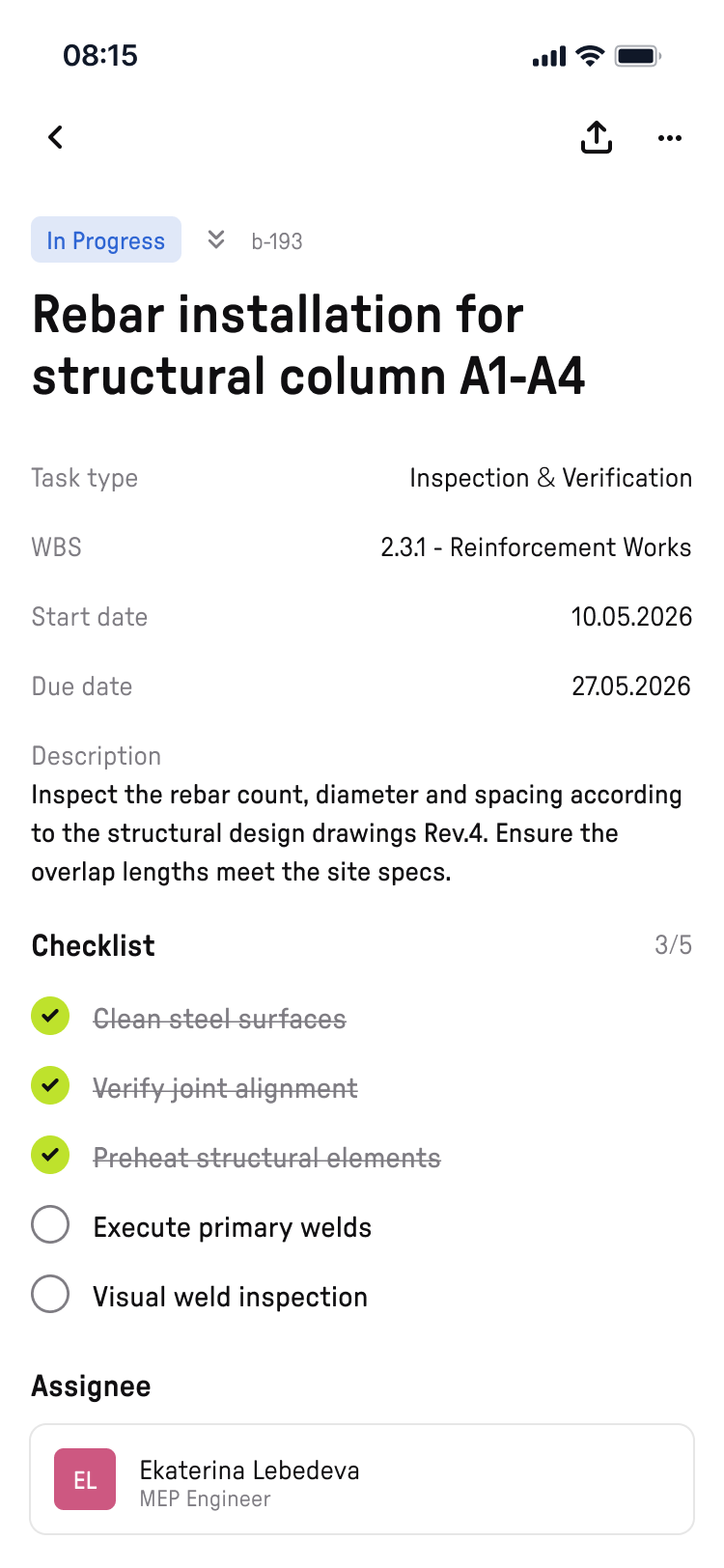
Type, dates, description, assignee. The checklist is a working tool on the spot.
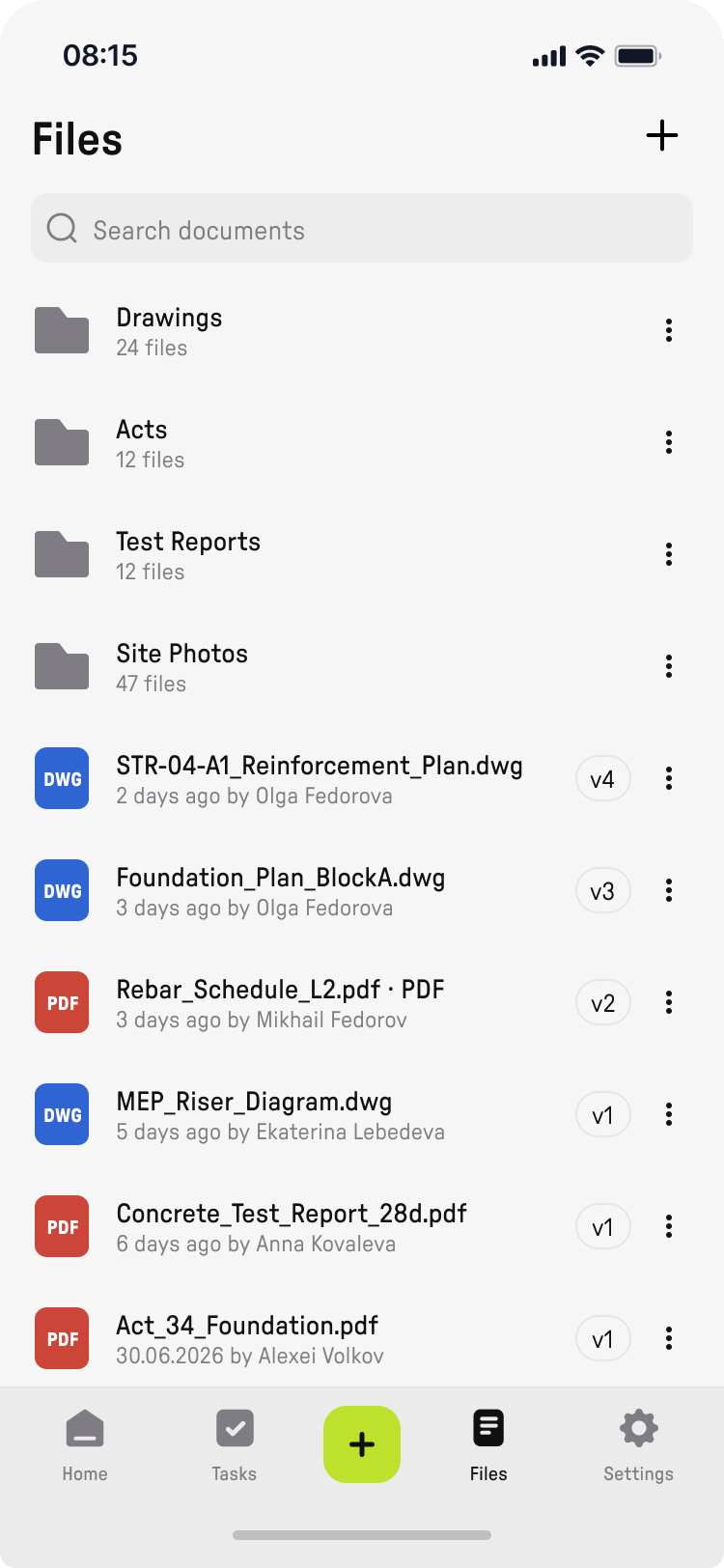
Files (CDE)
Files is the mobile slice of the CDE: folders by documentation type, recent files with version and author. No desktop filters.
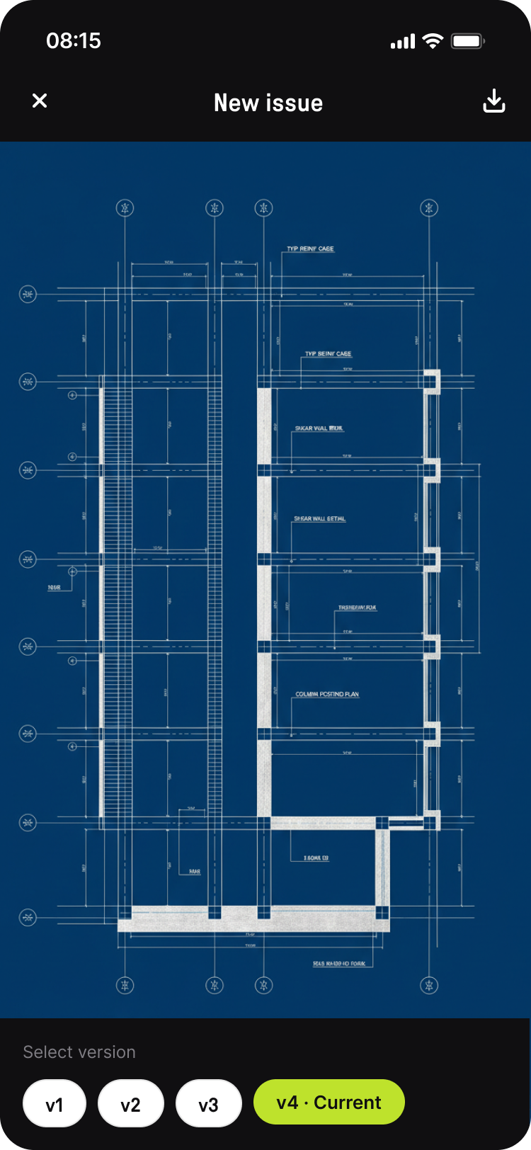
File viewer
Drawing view with a revision switcher. A direct answer to one of construction's biggest pains — working from an outdated drawing.
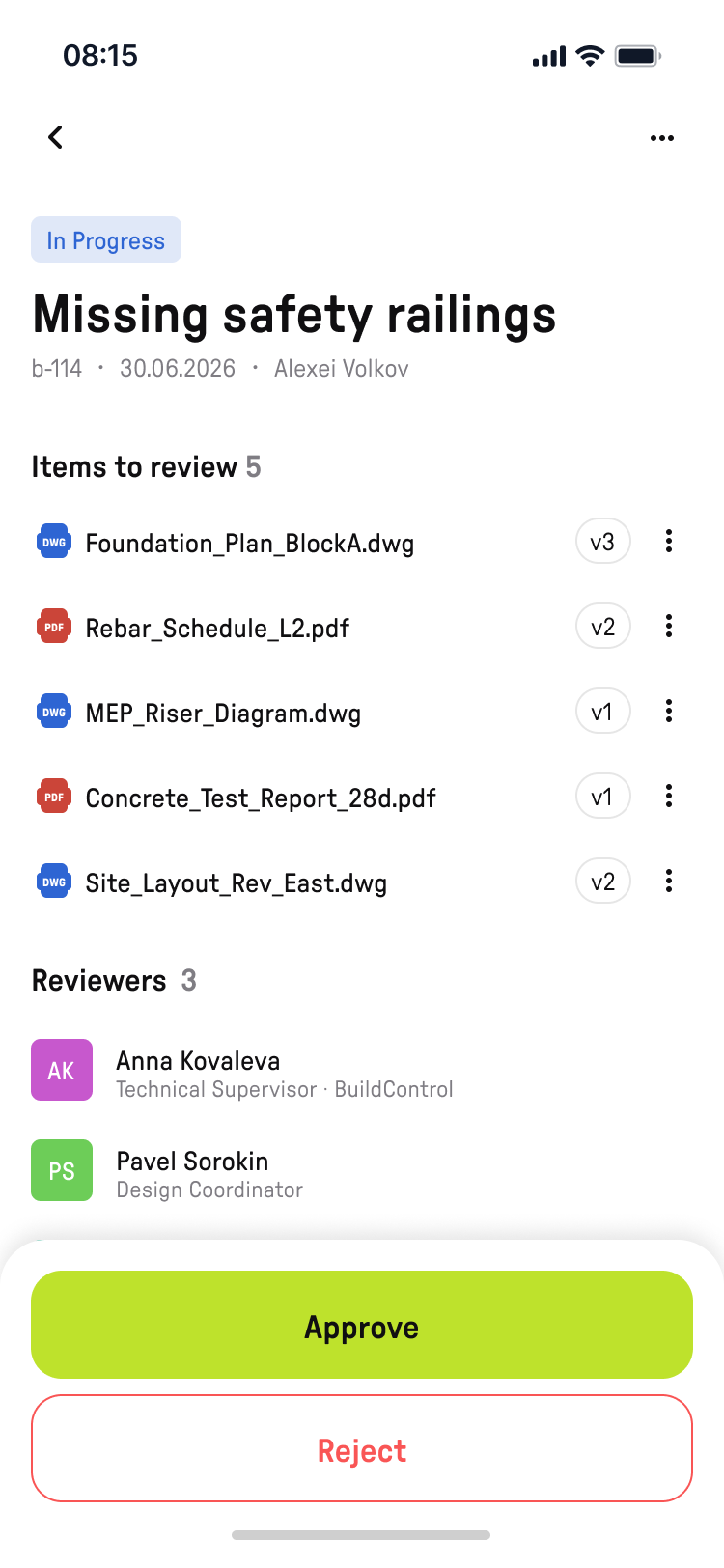
Approvals
Approval of a documentation package. The decision is made from the phone at the moment it's needed — not in the evening at a computer.
Outcome
The MVP was built as a narrowly focused product to test the hypothesis: seven key screens, five field scenarios, offline-first as a mandatory state. The scope was defined by research — interviews with decision-makers and field roles, plus an analysis of the patterns of Procore, Fieldwire, PlanRadar, and Autodesk Build.
The main lesson of this project is the discipline of saying no. The hardest part wasn't designing the screens — it was not carrying familiar desktop modules over to mobile: Gantt, CDE filters, portfolio analytics. Every element had to pass one question: "does a person in a hard hat, with one free hand and no connection, need this?" If not, it stayed on the web.
This principle — context of use first, functionality second — became my default way of thinking about multi-platform products: platforms don't divide features, they divide scenarios.